Search

Elevate your brand with our Creative Business Agency WordPress Theme. Sleek design, Powerful features,
Endless Possibilities.

We are here
6946 Calhoun Ave Van Nuys, CA 91405 United States
Follow Us
Contact Me
6946 Calhoun Ave Van Nuys, CA 91405 United States [email protected] +18184290049
Follow Us
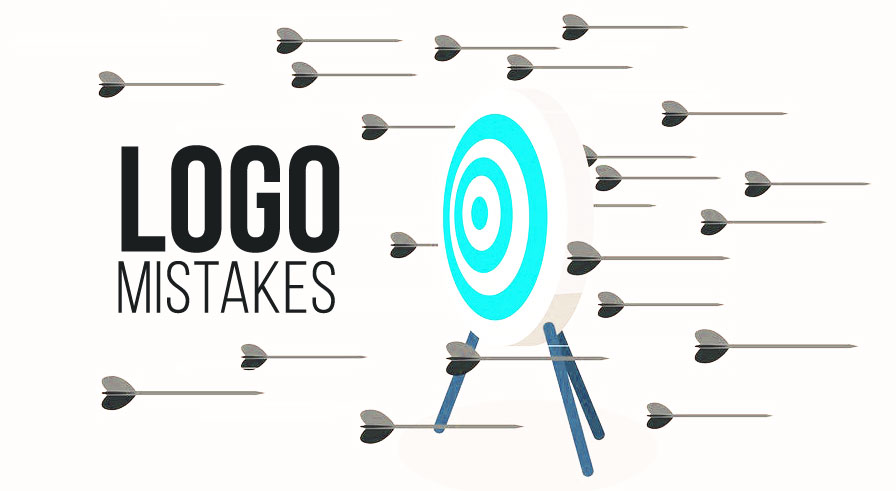
Logo Design: Common Mistakes to Avoid

Logo Design: Common Mistakes to Avoid

A well-designed logo is a critical part of a brand’s identity, serving as the face of the business across various platforms. However, designing an effective logo requires careful consideration and expertise. Here are some common mistakes in logo design that can hinder a brand’s impact:


1. Overcomplicating the Design

  • Description: Cramming too many elements or details into a logo can make it confusing and hard to recognize, especially at smaller sizes.
  • Solution: Focus on simplicity and clarity. A minimalist approach often works best.

2. Ignoring Scalability

  • Issue: A logo that looks great on a billboard but loses detail on a business card or website icon can fail its purpose.
  • Fix: Ensure your design is versatile and maintains clarity across different sizes and formats.

3. Relying on Trends Alone

  • Problem: Designing purely based on trends may result in a logo that feels outdated in just a few years.
  • Advice: Strike a balance between modern appeal and timelessness to create a lasting impression.

4. Poor Typography Choices

  • Mistake: Using fonts that are hard to read, overly decorative, or mismatched with the brand’s tone.
  • Solution: Opt for custom or professional fonts that reflect the brand’s personality while ensuring readability.

5. Neglecting the Target Audience

  • Error: Designing without considering the preferences and expectations of the target demographic.
  • How to Avoid: Conduct research to ensure the logo resonates with the intended audience.

6. Copying Other Logos

  • Issue: Replicating or heavily borrowing from other logos can lead to legal issues and a loss of originality.
  • Tip: Focus on unique elements that set the brand apart.

7. Using the Wrong Colors

  • Pitfall: Employing colors that clash, don’t represent the brand, or lack contrast.
  • Recommendation: Choose colors based on color psychology and ensure they align with the brand’s message.

8. Overlooking Negative Space

  • Problem: Failing to utilize negative space effectively can make a logo appear cluttered.
  • Solution: Use negative space creatively to add depth and interest without overloading the design.

9. Not Testing the Logo

  • Mistake: Skipping testing across different platforms and mediums can lead to unforeseen issues.
  • Best Practice: Test the logo on digital screens, print materials, and promotional items to ensure adaptability.

10. Ignoring Feedback

  • Flaw: Designing in isolation without seeking input from others or the client.
  • Fix: Gather constructive feedback from peers, stakeholders, and focus groups to refine the design.

11. Lack of a Vector Format

  • Mistake: Delivering the logo in raster formats like JPEG or PNG without a vector version.
  • Why It Matters: Vector files are essential for scalability and professional use.

Conclusion

Avoiding these common mistakes can make a significant difference in the effectiveness of a logo design. By prioritizing simplicity, originality, and versatility while considering the brand’s identity and audience, you can create a logo that truly stands out and supports the brand’s success.

Lets Talk for Quote

Wpweapons are here to create your website. Contact With Us

We will do our best to provide you different solutions, starting the cheapest but nice variants till the complex and big projects.

Address
6946 Calhoun Ave Van Nuys, CA 91405 United States


    Request Quote