Search

Elevate your brand with our Creative Business Agency WordPress Theme. Sleek design, Powerful features,
Endless Possibilities.

We are here
6946 Calhoun Ave Van Nuys, CA 91405 United States
Follow Us
Contact Me
6946 Calhoun Ave Van Nuys, CA 91405 United States [email protected] +18184290049
Follow Us
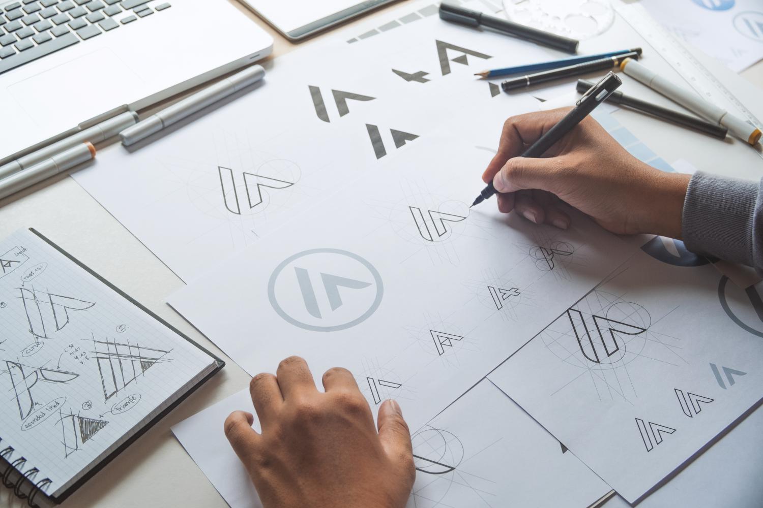
Logo Design Best Practices

Logo Design Best Practices

A logo is more than just a graphic—it’s the visual representation of a brand’s identity and values. A well-crafted logo can leave a lasting impression on your audience, convey professionalism, and distinguish your brand in a crowded market. Here are some best practices for designing an effective logo:


1. Understand the Brand

  • Why It’s Important: A logo must reflect the brand’s personality, mission, and target audience.
  • How to Do It: Research the brand thoroughly. Consider its industry, values, and tone—whether it’s playful, corporate, elegant, or edgy.

2. Keep It Simple

  • Why It Works: Simple logos are easier to recognize and more versatile for various mediums.
  • Example: Think of iconic logos like Apple or Nike—clean and memorable.
  • Tip: Avoid overcrowding with unnecessary elements or complicated details.

3. Make It Scalable

  • Why It’s Crucial: A logo should look great whether on a business card or a billboard.
  • How to Test: Ensure the logo maintains clarity and impact in both large and small sizes.

4. Choose Timeless Design

  • Why It Matters: A logo should stay relevant for years to come, avoiding trends that fade quickly.
  • Tip: Stick to classic design principles and avoid over-reliance on contemporary trends.

5. Focus on Versatility

  • Why It’s Necessary: Logos appear on various materials and platforms, from websites to merchandise.
  • How to Adapt: Design in vector format to allow for resizing without quality loss and test the logo on different backgrounds.

6. Use Appropriate Colors

  • Why It’s Powerful: Colors evoke emotions and convey brand messages.
  • How to Use: Choose colors that align with the brand’s identity. For example, blue often conveys trust, while red symbolizes energy and passion.

7. Choose the Right Font

  • Why It Counts: Typography can set the tone of the logo—whether modern, traditional, or playful.
  • Tip: Avoid overly decorative fonts and ensure text is legible in all sizes.

8. Incorporate Symbolism

  • Why It Adds Value: A logo with a subtle, meaningful symbol can be more engaging and memorable.
  • Example: The Amazon logo’s arrow doubles as a smile and indicates a to z, symbolizing a comprehensive service.

9. Test Across Mediums

  • Why It’s Key: Logos are used across digital and print media, requiring consistent performance.
  • How to Test: Check how the logo looks in black and white, on different screen sizes, and in physical prints.

10. Seek Feedback

  • Why It’s Beneficial: Fresh perspectives can highlight areas for improvement you might overlook.
  • Tip: Share drafts with colleagues or focus groups and be open to constructive criticism.

Conclusion

By following these best practices, you can create a logo that is not only visually appealing but also effectively communicates your brand’s essence. A successful logo is timeless, versatile, and aligned with the brand it represents, serving as the cornerstone of its identity.

Lets Talk for Quote

Wpweapons are here to create your website. Contact With Us

We will do our best to provide you different solutions, starting the cheapest but nice variants till the complex and big projects.

Address
6946 Calhoun Ave Van Nuys, CA 91405 United States


    Request Quote