- WPW Content Styler
- Get Started
- How to style elements separately
- How to style wordpress page elements
- How to change mouseover style
- How to change wordpress page fonts
- How to style wordpress page conditionally
- How to make website mobile friendly
- What to do if styles do not apply
- How to add CSS code to wordpress theme
Install WordPress plugin WPW Content Styler
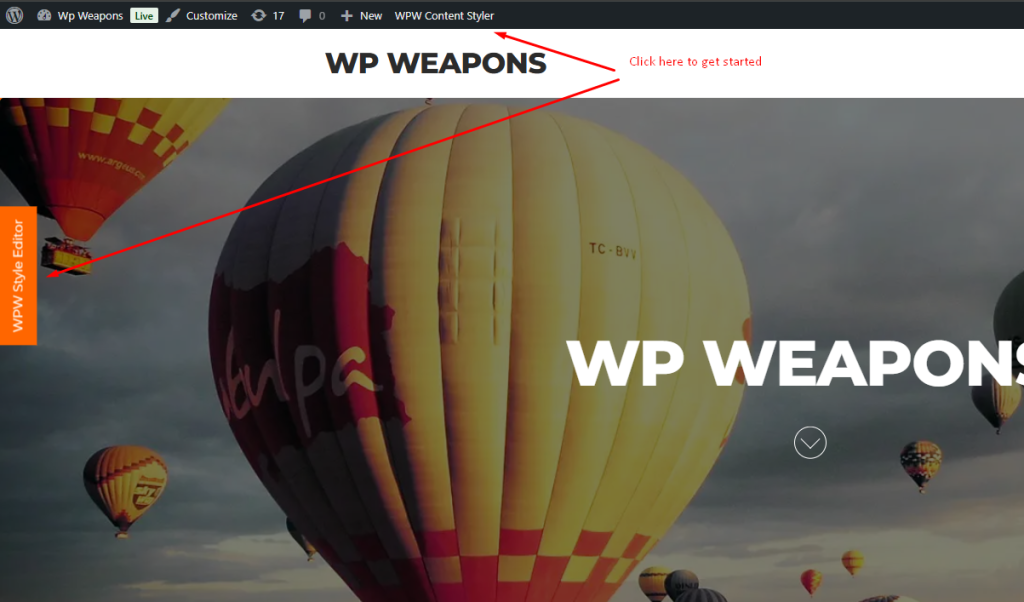
Login as administrator and visit to the page you want to edit style and click on WPW Style Editor button
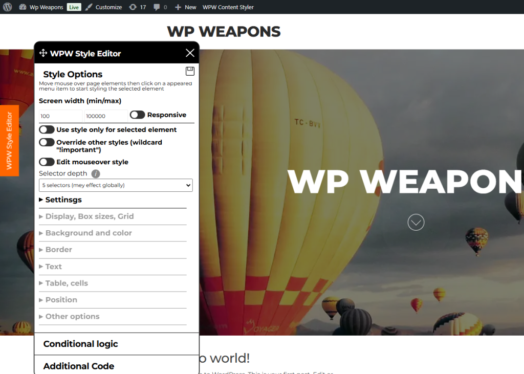
It will load editor tools widget
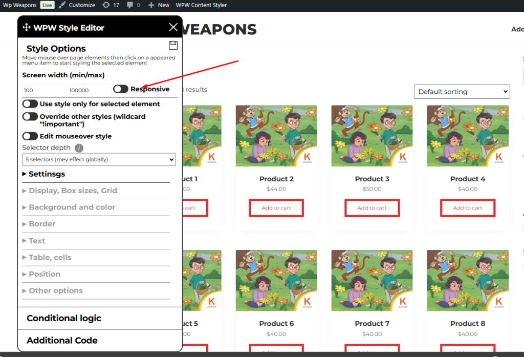
Find “Responsive” switcher in “Style Options” tab
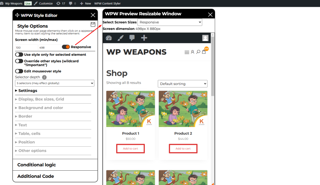
Click on switcher to enable resizeable window. You can resize window style according to window width.
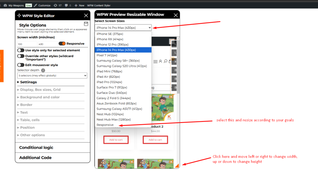
You can select different devices from “Select Screen Sizes” dropdown it will resize window according to target device screen width , if you need another screen width for styling select “Responsive” option and resize widget/window via the tool on bellow screenshot
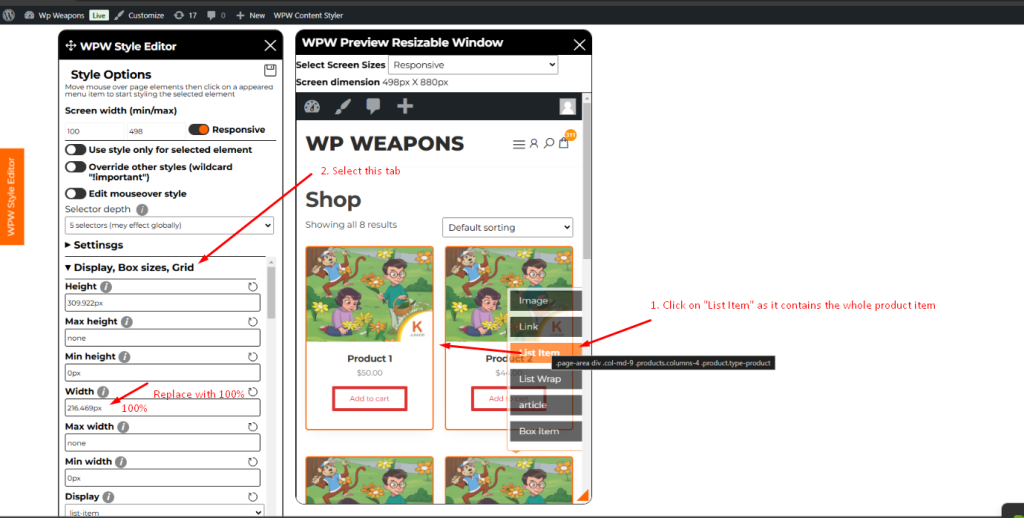
Now it is time to style. It works in the same way as on desktop version. Move mouse to the target element and it will open menu. Click on menu item you want and start styling.
Let’s assume you want to change gird items width to full width for mobile.
Follow the steps on the screenshot above .
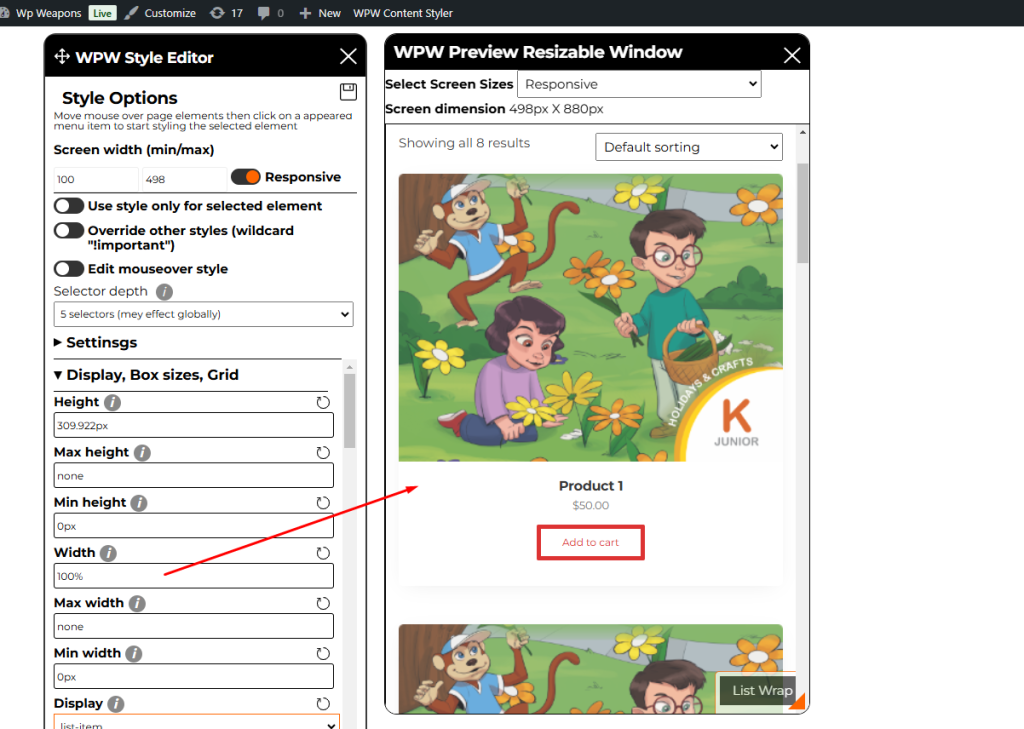
Here is the result after setting “100%” in the field “Width”
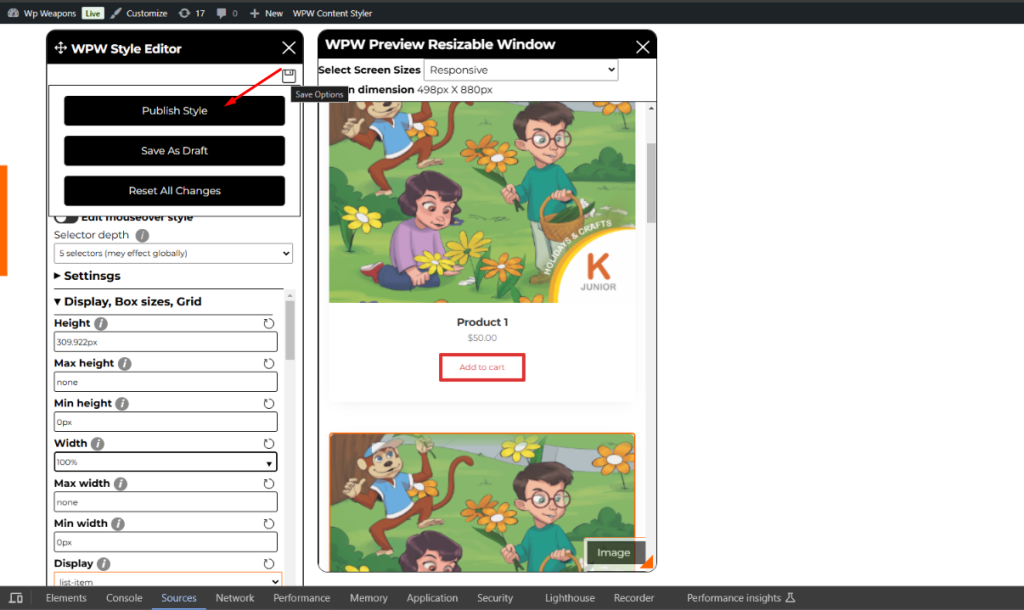
It is is time to save changes. Find “Save” icon at the top of editor widget and move mouse on it, There are the following button
- Publish style
- Save as draft
- Reset all changes
That is is, enjoy !!!

